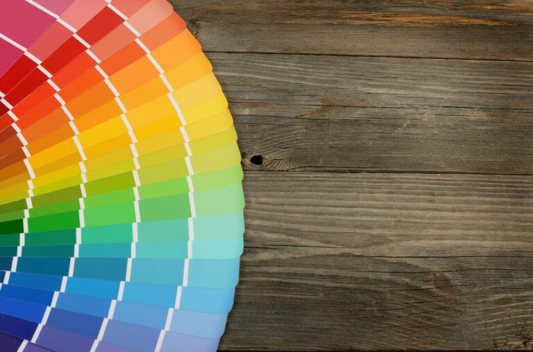
The color palette on the wooden background
The psychology of color is a persuasive technique that marketers and branding specialists use throughout the creation and display of a brand.
When we think of logos and signage, we may think that someone simply picked a color off a wheel and rolled with it. But there’s much more to it than that.
Did you know that the strategic use of color in your branding uses emotions to create higher lead conversion? That is, if you do it right.
You can make the most of your branding and interior signage with clever use of color psychology. Keep reading to find out how color can influence your customer’s mood and work with The Sign Factory in Charlotte to get customer interior signs for business!
Color Psychology: What Colors to Choose
When it comes to color selection, there’s much to be understood before you can take a look at the color wheel.
Which colors provoke what emotion? How will a certain color make your customer feel?
Let’s have a look at some of the most frequently utilized colors:
Brilliant Blue
Blue is evident in some major brands that we all know and love, so how does that make us feel?
The color psychology of blue says that it should invoke feelings of trust and integrity in the brand. Because the color blue is tranquil and strong, it can make your client feel loyal and create an intelligent atmosphere.
Glorious Green
Green is synonymous with nature and the environment, which means that it can create a feeling of harmony and balance when used in branding.
It usually has a calming effect if it’s used in the right shades.
Green can create an atmosphere that portrays growth and freshness.
Youthful Yellow
It doesn’t take much thought to know that yellow creates visions of youth and happiness.
It’s one of the most cheerful colors on the color spectrum.
Invoking feelings of motivation and inspiration, yellow can be beneficial to a brand that wants to be seen in a positive light.
Passionate Pink and Purple
Purple is a color often associated with spirituality and pride, if your brand is looking to inspire feelings of creativity, passion, and imagination, then this is the color for you.
Pink, on the other hand, promotes a feeling of love and compassion. Also, if your brand is focused on a feminine audience, it’s great in inspiring a potential client to feel emotionally connected to the brand.
Ravishing Red
Red is an extremely powerful color. Think of how many global brands use the color red in their branding, and the impact that it makes.
Red also inspires passion from those viewing it and can create an emotional connection tied to excitement, power, and vigor.
The Black and White of it
Black and white are generally associated with very corporate brands from days gone by, nowadays, we associate these colors with different brands depending on how they’re used.
Black inspires seriousness and sophistication, so if your brand is elegant and aimed at a higher income bracket, then it’s one of the best colors you can use in your branding to make a statement.
White is the opposite of black, stirring feelings of innocence, purity, and simplicity. But it is a color that needs to be used alongside a companion to create a powerful reaction in your ideal customer.
Using Color Psychology in Your Interior Signage
The layout, design, and interior signage of your office can have an extremely positive effect on your customers if done right.
Experiential design using architecture and specialty interior signage is a surefire way to invoke an emotional response to your internal branding.
Using the architecture of your branding within the office can be so useful for a powerful impact. If you have large white walls, or a stark reception area, using the effect of letters that match your brand’s colors and persona in a 3D displayed way can be impressive.
The First Thing Your Customer Sees
Take a moment to walk your customer’s journey and see things as they do.
What’s the first thing they see when they walk in the door?
Are they greeted by a bland lobby? Is the brand immediately visible when they enter the door? What is the first thing their eyes are drawn to?
If you find the right custom solution supplier, they’ll be able to draw up ideas of how custom signage for the interior of your lobby and throughout your offices can be done with a bang!
The age-old saying, “You only get one chance at a first impression,” is undeniably true when it comes to your internal office signage and how you use color psychology to drive your brand’s message home.
Don’t Go Overboard
We want to caution you that using too many color combinations can do more harm than good.
If you’re looking for ways to incorporate certain colors so that they can influence your customer’s mood, we suggest looking at your brand first.
If you use too many colors within your office signage, you’ll simply be promoting a mess of emotions and your customer will ultimately be confused.
Stick to one or two great color combinations that match your logo and your brand’s style, then use these creatively and strategically throughout the design of your office.
Remember, colors will pop if they’re used against stark colors like black or white. Your customer will focus on the color that their eye is drawn to first. So pay attention to what emotion that color might invoke.
Color Psychology Throughout Your Brand
If you’re serious about using color psychology throughout your brand, then it’s not enough to simply add a few lobby signs and hope for the best.
Take the time to analyze your brand from the ground up, are there other changes that need to be made? Once you’ve done this, you will have a clear idea of what you want your office to look like.
For color psychology to truly have an impact, contact our team at The Sign Factory in Charlotte for custom interior signs for your business today!