Channel letters for restaurants in Charlotte, NC, are a lot like a business card for an attorney or a tile sample for a contractor: they set the tone for interactions. As a signage product, channel letters are among the most popular marker choices in the hospitality industry. What makes this product selection so useful?
Put the Customer in the Mood for Your Food
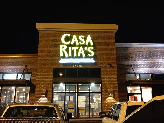
A hungry customer walks across the parking lot of the mall. Suddenly s/he spots Casa Rita’s setup. Green backdrops hold vivid letters with white returns and yellow fronts. An underscore reprises the green and white colors. Against the red brick backdrop, the yellow and green colors clearly communicate the availability of Mexican food. For the hungry customer, this sounds like a great idea! If this were your sign, you would have just succeeded in reeling in a consumer willing to commit to an impulse buy. Putting the guest in the mood for the type of food you sell is one of the many functions a well-designed building sign should accomplish.
Provide a Beacon after Dark
Kenna Coal-Fired Kitchen succeeds in spectacular fashion when it comes to bringing in customers after dark. The restaurant’s façade looks great during the day but lacks upper-level illumination after the sun sets. The bright LEDs, which the white channel letter fronts reinforce, create an eye-catching contrast to the darker building’s front. Combined with the red colors contained in the “Coal Fired Kitchen” portion of the channel letter sign, the appearance brands the eatery while signaling the availability of food across a large distance. Bringing in hungry guests across this parking lot is a snap with the illuminated sign.
Standing out in the Business District
Restaurants in a business district usually count on office workers to be their targeted demographics. But when the offices are closed, the eateries must stand out in their own rights and signal to passersby the availability of food. Since it is well known that customers are not afraid to travel if there is a particularly savory food to be had, savvy hospitality industry insiders ensure the presence of at least one or two signature dishes.
Making the location stand out in an area where parking may be at a premium is easy with the right channel letters. Amelie’s French Bakery And Café does just that. The choice of channel letters blended with a lightbox cabinet sign makes the exterior really stand out. The venue’s location places it on the ground floor of a multi-story office building. Its signage and lettering identify the French flair while the display situated near the building’s corner, rather than above the entrance, actually targets motorists. Doing so brings in impulse buyers as well as those who are in search of a bakery versus another food option.
Designing Channel Letters for Restaurants in Charlotte, NC
Set up side by side, it is clear that the meticulous planning that has gone into each design contributes to the company’s successful approach to bringing in hungry guests. Whether it is a color combination, a well-calculated illumination option or the placement of a sign, do not leave the effectiveness of your signage to chance. Contact our graphic artists to learn more about the best channel letter options for members of the hospitality industry.